The Problem with the Look of Modern Comics
I consider the best looking comics were made during the 1990s.
It may be nostalgia (I grew up in that era) or a personal taste, but it's more the latter than the former, as I wasn't heavily exposed to my current preferred style during my childhood, but later in life.
When I was young I grew up in Egypt, where foreign comic books were rare and difficult to come by, especially before the internet. So while the American boys' first love was Marvel comics the few physical comics that I read were DC comics, in the Bruce Timm style.
So if my current taste was shaped by nostalgia it should have been the clean lines and bright colours of (The Batman and Robin Adventures) or (Superman Adventures) of 1997, but it is actually closer to the style of Val Semeiks in Etrigan Volume 3.. the detailed art with its busy backgrounds and heavy inks.. and the Judge Dredd progs that were made in 1997-1998.
I tried for a long time to put my finger on what exactly bothers me in modern comics.. the aesthetic appeal (or quality) that is lost when I compare it to the comics of the 90s, and I believe I finally figured it out.
For a while I thought it was the digital colouring. But a lot of the comics of the 90s were coloured digitally, with gradients hard to achieve before the era of computers.
Then I realized that the colouring itself wasn't the actual problem, but that the colours & paper became too slick.. the whites too bright.
I don't know when the inking process stopped being done by hand, but I feel that the modern inkers are shifting the burden of their work to the colourist.. so many of the lines aren't done by black inks but by variations of colours.
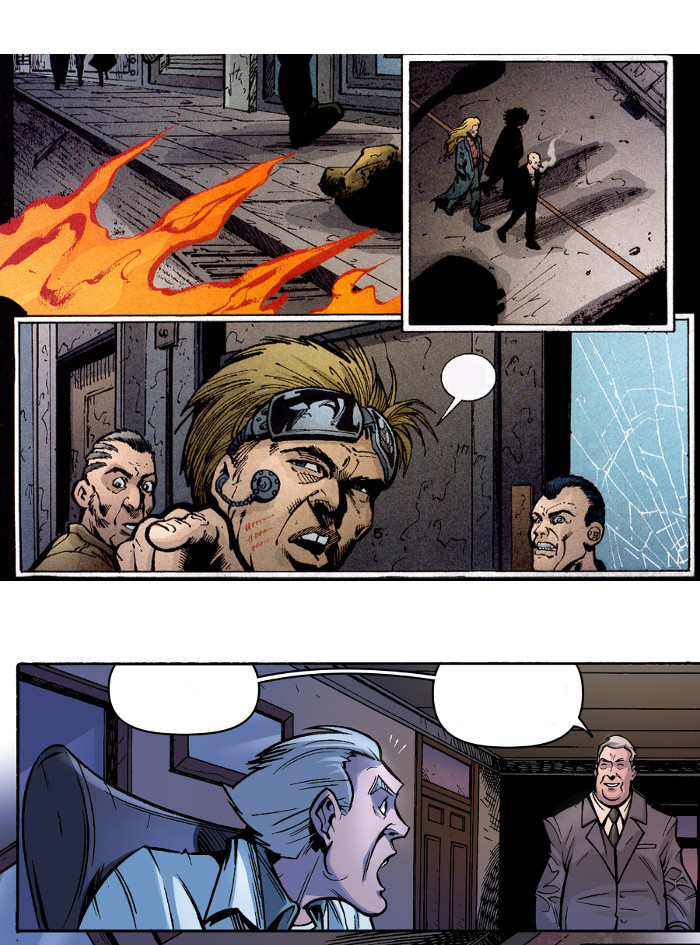
Compare this to something like Transmetropolitan (1997), which is perfectly balanced between pencils, inks and colours.
The modern comic art will look empty and simplistic without its colours, while in the "olden days" the sketches were rich in detail and can stand on their own after being inked. Colouring was "added flavour".
Another reason I find the 90s comics superior to the current ones is the quality of paper.
Modern comics - and digital comics - use a "very white" white. The old grainy paper was never 100% white, and that added a certain quality to the colours, something that is absent from the sterile modern comics.
Compare the original (The Maxx) with the remastered (The Maxx Maxximized) to see what I mean.
(It's similar to the difference between shooting movies on Film and Digitally)

تعليقات
إرسال تعليق